
-
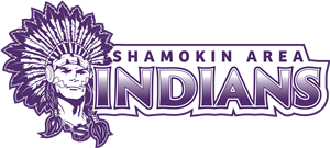
The Shamokin Area School District has recently adopted a new custom logo and word mark design. To make the new logo unique and significant to Shamokin Area, we incorporated five symbolic elements to reflect the District’s identity and heritage:
1. The figure now wears an “S” medallion to represent Shamokin Area.
2. The necklace is adorned with coal, referencing the region’s deep anthracite tradition.
3. and 4. Within the detailing of each ponytail, you’ll find stylistic representations of a demon and a greyhound—subtle nods to the legacy of the schools that merged to form Shamokin Area.
5. The war paint on either side of the face loosely mirrors the boundaries of the Shamokin Area School District.
In addition to the updated design, we’ve created multiple versions of the logo for versatile application across platforms and products. These include:
• Three primary formats: Head only (no longer cropped), upper body (from the crossed arms up), and full body standing.
• Color variations: Each version is available in black only, purple only, black and white, purple and white, black/white/purple, and black/white/purple/gray.
There is also a version of the head-only logo paired with a custom word mark. The word mark features “SHAMOKIN AREA” in Bree Bold (all caps), and “INDIANS” in Trajan Sans Pro Bold (all caps), and is available in all color ways listed above.
Finally, all logo versions are now available as high-quality vector files—along with PDF, JPG, and PNG formats—to ensure consistency, clarity, and scalability across print and digital media.
We are encouraging the use of the new logo and word mark design whenever possible (especially businesses currently producing Shamokin Area attire and products).
Select a School...